Reports: A walkthrough the feature

Updated over a week ago
Automated reports can be sent to your team internally within your company or to your clients or to yourself for your own reporting purposes. You’ll begin by navigating to the admin section of the dashboard and click on the reporting tool icon.
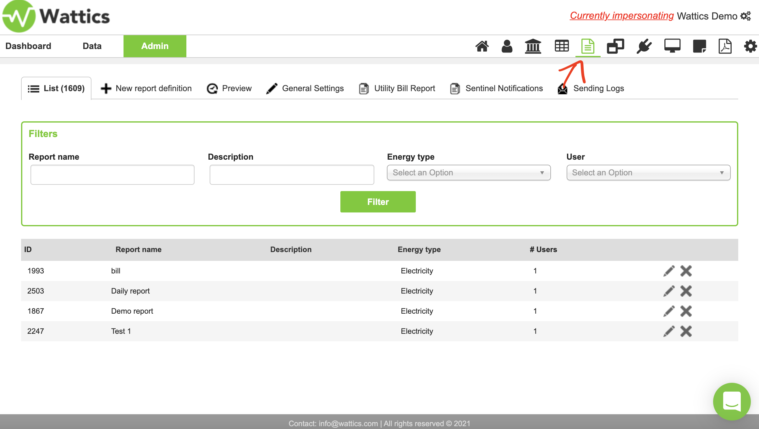
Figure 1.
All reports that have already been created you will find in a list, easily searchable using the filters at the top of the screen. To create a new report, select ‘new report definition’.
When setting up a new report, you need to give your report a name, description, select the energy type—electricity, gas or water—the date that the report will go out every month, the time shift in months i.e. how many months’ data to be included in the report. For example, a value of 2 means that the June report will use data from April. Next you can choose if the recipient(s) will receive reports for all sites in your AiElements account or only for selected sites.
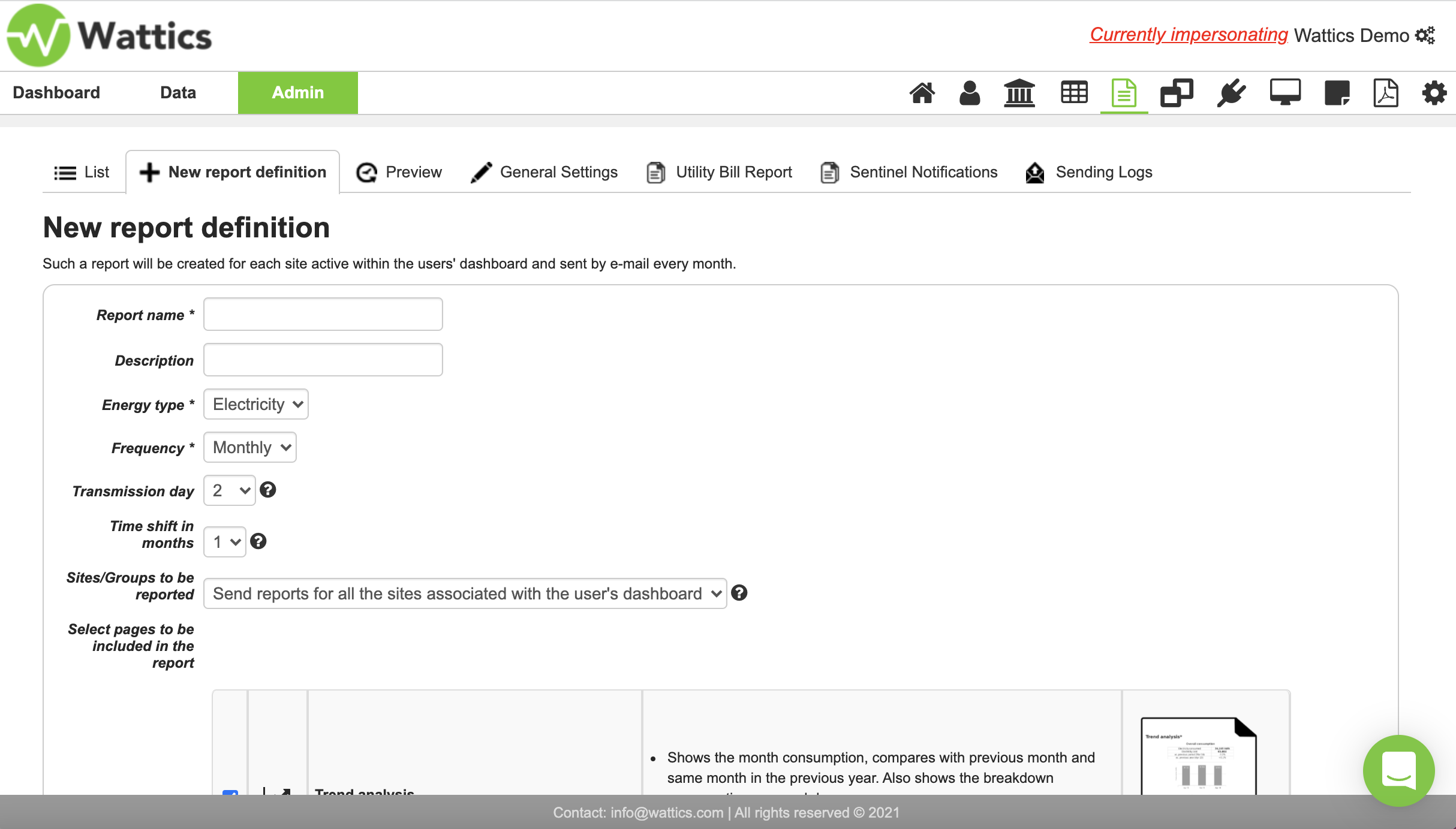
Figure 2.
The next step is to select the reports that you would like to send.
There are 11 pre-built report pages (with this number continuing to grow), from which to choose. You can select multiple ones by clicking on the checkboxes on the left. On the right, you have a thumbnail, which you can click to view a sample of any report. The trend analysis report shows the month’s consumption, compared with previous month and same month in the previous year. It also shows the breakdown consumption per weekday. The drop down list is visualised in Figure 3. below.
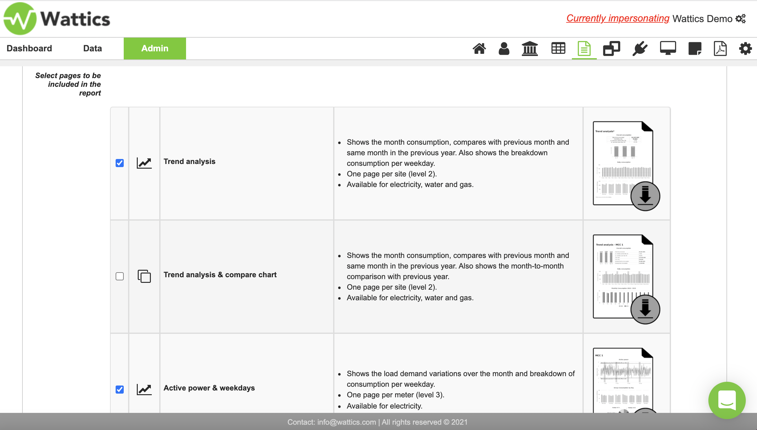
Figure 3.
The trend analysis & compare chart shows the month consumption, compares with previous month and same month in the previous year. This report also shows the month-to-month comparison with previous year. The active power & weekdays report shows the load demand variations over the month and breakdown of consumption per weekday
The heatmap & operations analyser report shows month heatmap and the wastage analysis - i.e. energy intensity of any monitored area or piece of equipment throughout the day in half-hourly intervals.
Operations analyser & weekdays - Shows consumption per weekday and breakdown of consumption and cost for workdays/weekends. This report is key when evaluating current operation for efficiency improvements.
The top 3 consuming areas report displays the greatest energy offenders for a site. i.e. in a hotel, this could be for example the HVAC, Refrigeration, or Rec/leisure centre
The next report, the top 3 consuming sub-areas show top consumers of energy at appliance level for the top 3 consuming meters. Using the hotel example again, the sub-meters feeding into the HVAC system could be AHUs, air compressor, boiler, for Refrigeration it could be the compressors, or fans, and for the rec/leisure centre, it could be the heat pump of a pool or lighting.
The deployment report shows which points are monitored with physical meters and others with virtual meters.
The energy performance report shows the data points in the dashboard that have KPIs applied for reporting. This sample report shows consumption in relation to production data.
The Sentinel report, shows the total number of machine-learning-powered events that have occured for each monitored point displaying the cost due to an event being above normal or below normal, as well as the difference between the two. Cost difference is displayed in green if it is a saving and displayed as red if it is an expense.
Finally the utility bill is a report that resembles a utility bill sent out by energy suppliers, which you can customise with information such as amount paid, amount outstanding or due, tax name and percentage, and cost per meter and so on. Cost per meter is especially helpful for sub-metering, where you have a multi-tenant building for example, and you can send a bill with the exact cost breakdown per tenant/apartment. The utility bill report can be generated for electricity, water and gas.
You can also add comments in the bill, which you can include here.
The utility bill can be customised further, in this section here, where you can add information and costs related to peak demand and/or other services rendered.
In this example we have a charge for the smart meter lease, and daily refuse collection, I’ve entered the appropriate ‘quantity’ option from the drop down menu and filled in the related cost information.
Once you have set up your reports, you also have the option of exporting the information from these bills for any site using our utility bill export tool. You can select the report, date range and export to excel if required.
If we move further down, you can see that you can add a personalised header and footer to your bill and select the clients you would like to send the report to. You can also add a header and footer in ‘General Settings’ above for all your reports to be sent out with a standard header and footer.
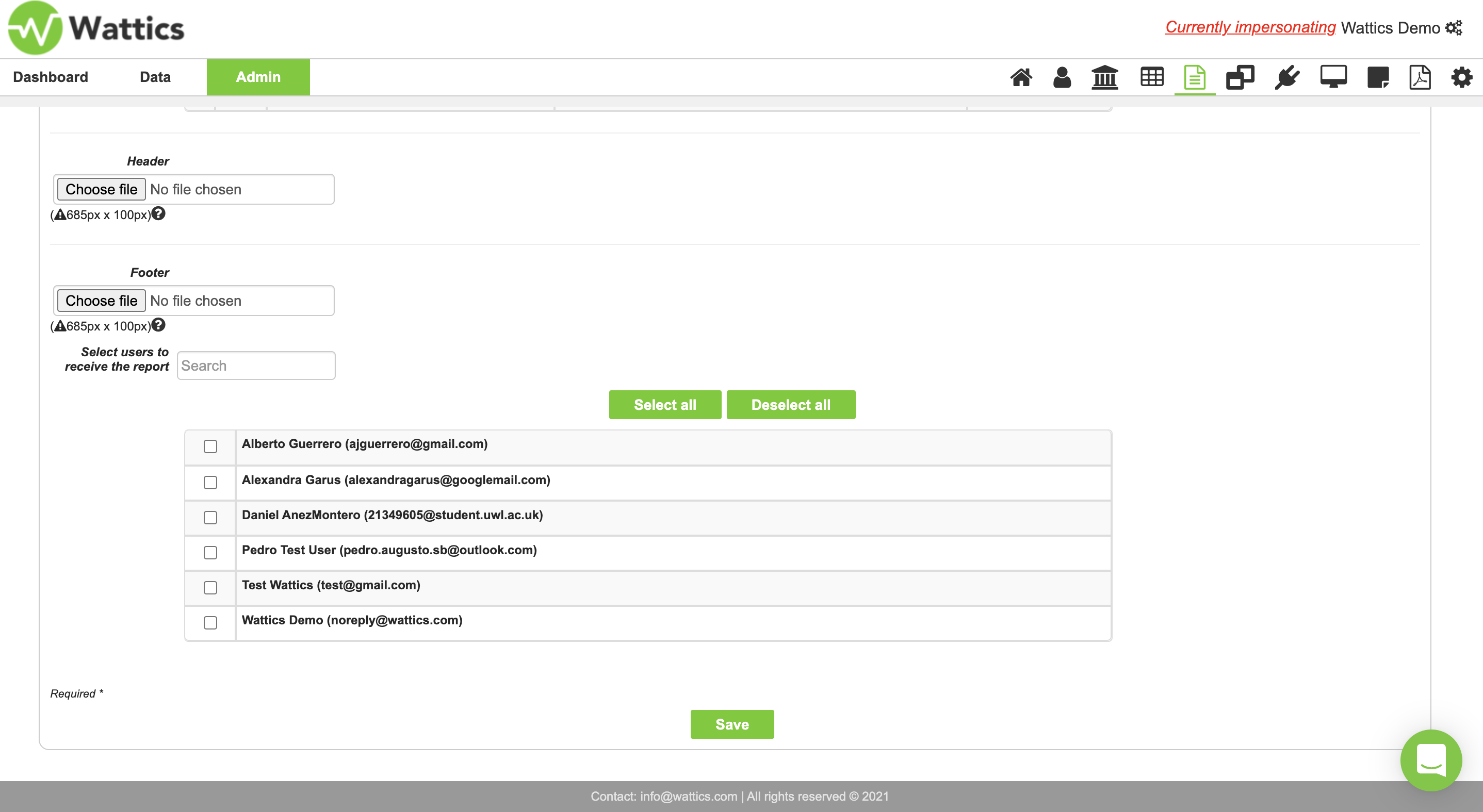
Figure 4.
Once you save the report you will be able to see what this looks like when sent internally to your team or clients. The report displayed below is the AiElements branded report with the AiElements green colour, logo, header, footer and contact information.
Figure 5.
You can have these reports completely customised with your branding, including your logo, colours, header and footer as we’ve seen, contact information and custom email sender address, so the report will look like it has been sent from you and not from AiElements. When selecting the white-labelled AiElements subscription, this customisation comes at no additional cost to you.
The great thing about automated reports is that you set it up once and they will automatically send monthly. It is systematic and easy to use, and saves you time, eliminating the need to copy and paste or import graphs from spreadsheets and other documents. See some more examples of the graphics on the report below.
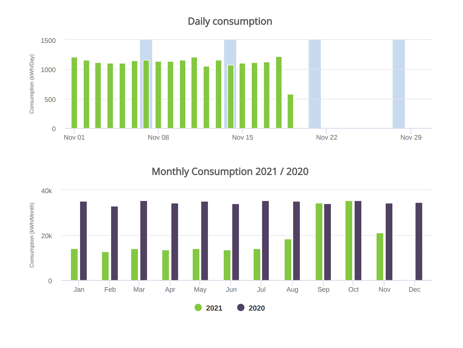
Figure 6.