Breakdown Analysis

Updated over a week ago
The breakdown tab is the main tool that analyzes energy in kilowatt-hours, CO2 emissions or currency costs. In the breakdown tab, you can visualize all your data in several different graph formats, select the granularity you wish to view your data in, compare data, add overlays to your visualizations and even generate files to share with people you wish.
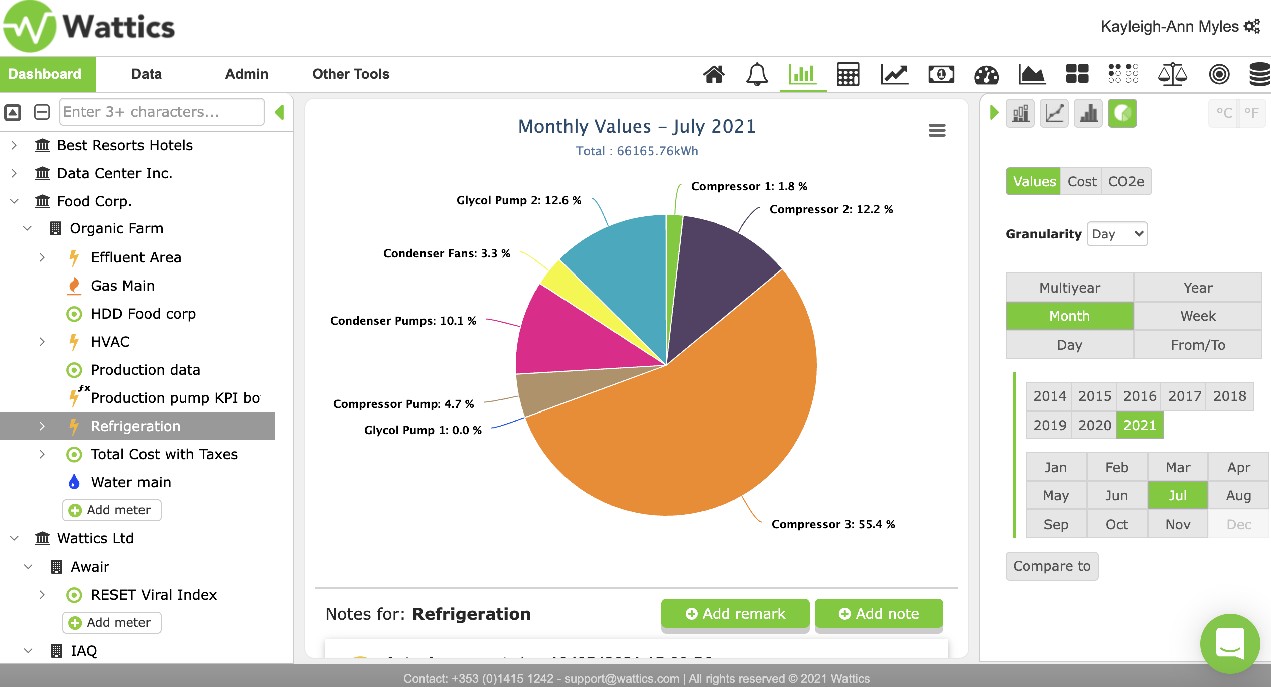
Let's first touch on the graph options on the Breakdown tab and how you can utilize this option to suit your data. In the image below you can see a pie chart. In this pie chart, the energy usage from all the loads in the refrigeration section of an organic food farm is visible in kWh. This can be extremely useful in highlighting the different percentages of energy being consumed by each load.
If you wish to know how you can upload data to the platform please first navigate to the page here.
Example one: If I wanted to see where the largest amount of energy is being consumed, I would select a data point and visualize this in pie chart form. Here, I will be able to characterise the different points within a site in either kWh, carbon footprint or cost to determine where the largest and smallest consumption, CO2 production or costs are. In this particular case, I would focus on compressor 3 and see if there is an opportunity for savings or certain times where I can reduce the energy usage. We will revert to this use case when discussing the overlay options.
The other graph options include column, spline and stack charts. You can select these options on the right side of the feature tab seen above. The other visible options in the right side menu include the granularity in which you wish to view your data and the time frame also, meaning once your data point starts running you can then access the data from any point there-on-in.
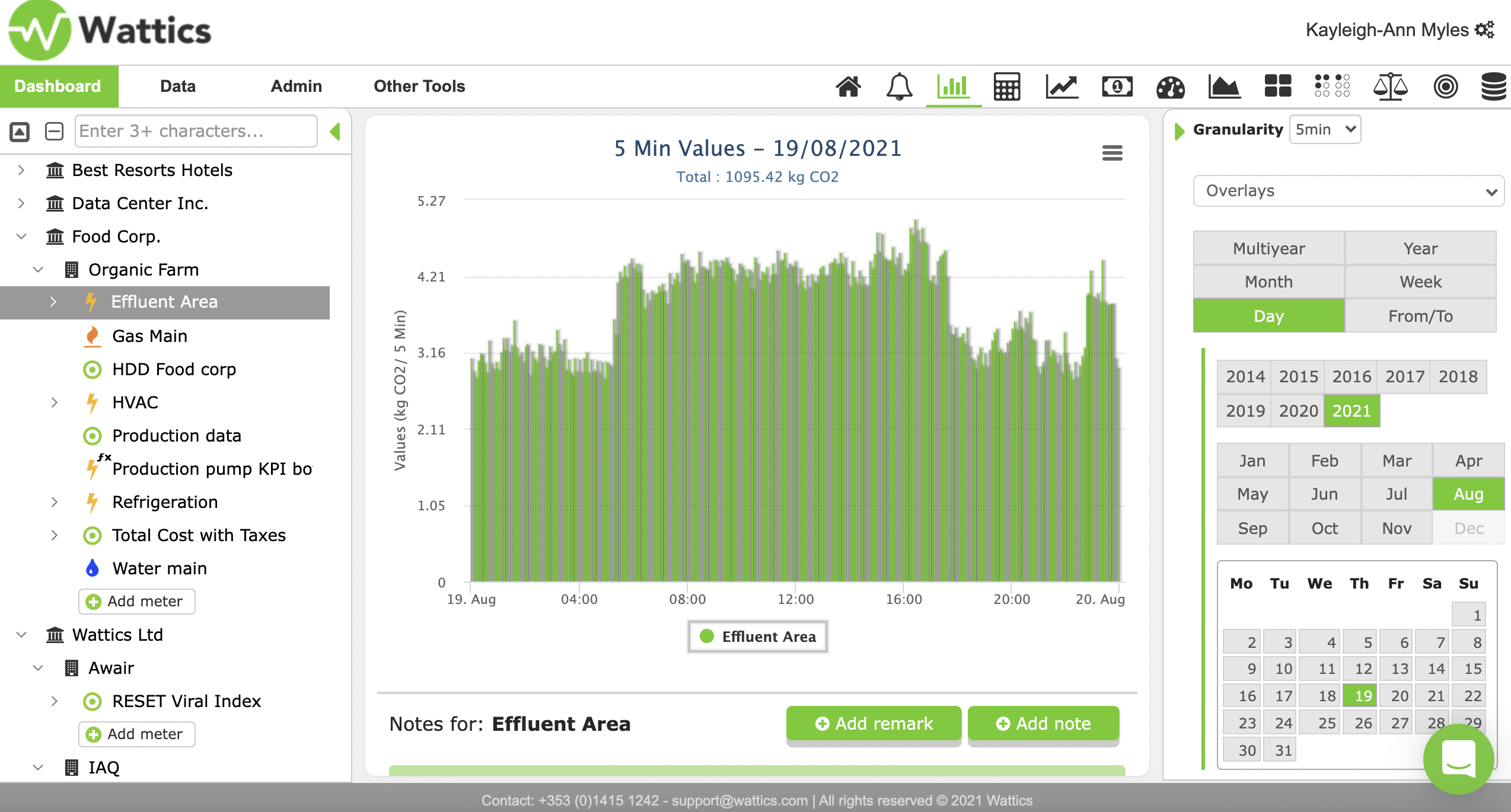
Example two: You wish to know your CO2 emissions for a particular date, you can then select the exact date and select CO2 in the right side menu and automatically without any further action your data will be visualized in the graph format of your choice. Furthermore, the total is displayed above the graph and you can add notes on the specific date to ensure that all the relevant information regarding the data is available when you select that date. This information can be added by clicking add remark or add note in the bottom right of the graph view.
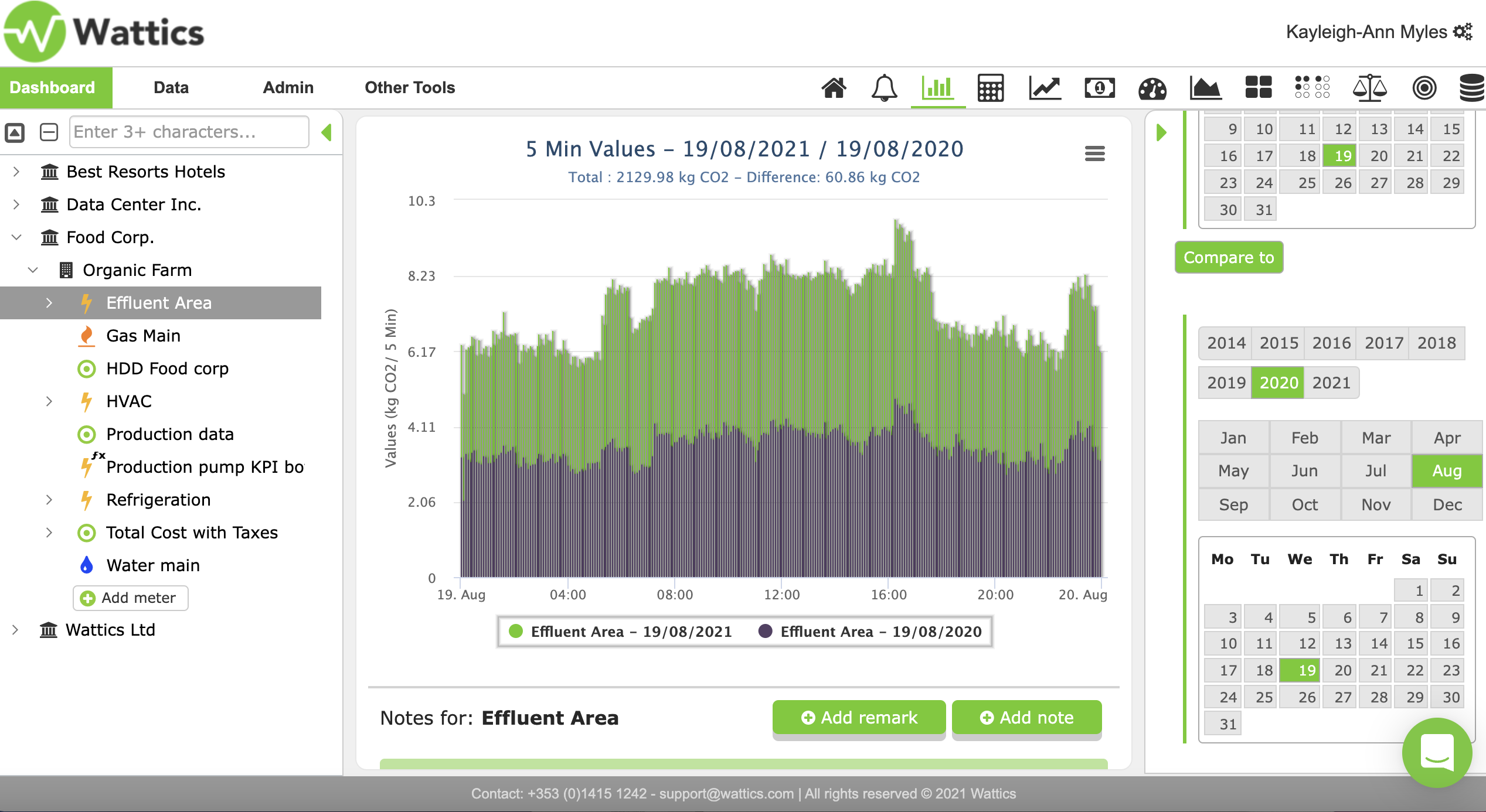
Even more, if you wish to compare your data, this is also possible with your breakdown tab. By scrolling down on the right side menu, you will see a green button reading compare. Select the date you wish to compare the date to firstly and then select the next date in the compare section. Instantly, you will visualize your data and create a comparison graph that reads the total and hourly/daily readings for each date. See an example below.
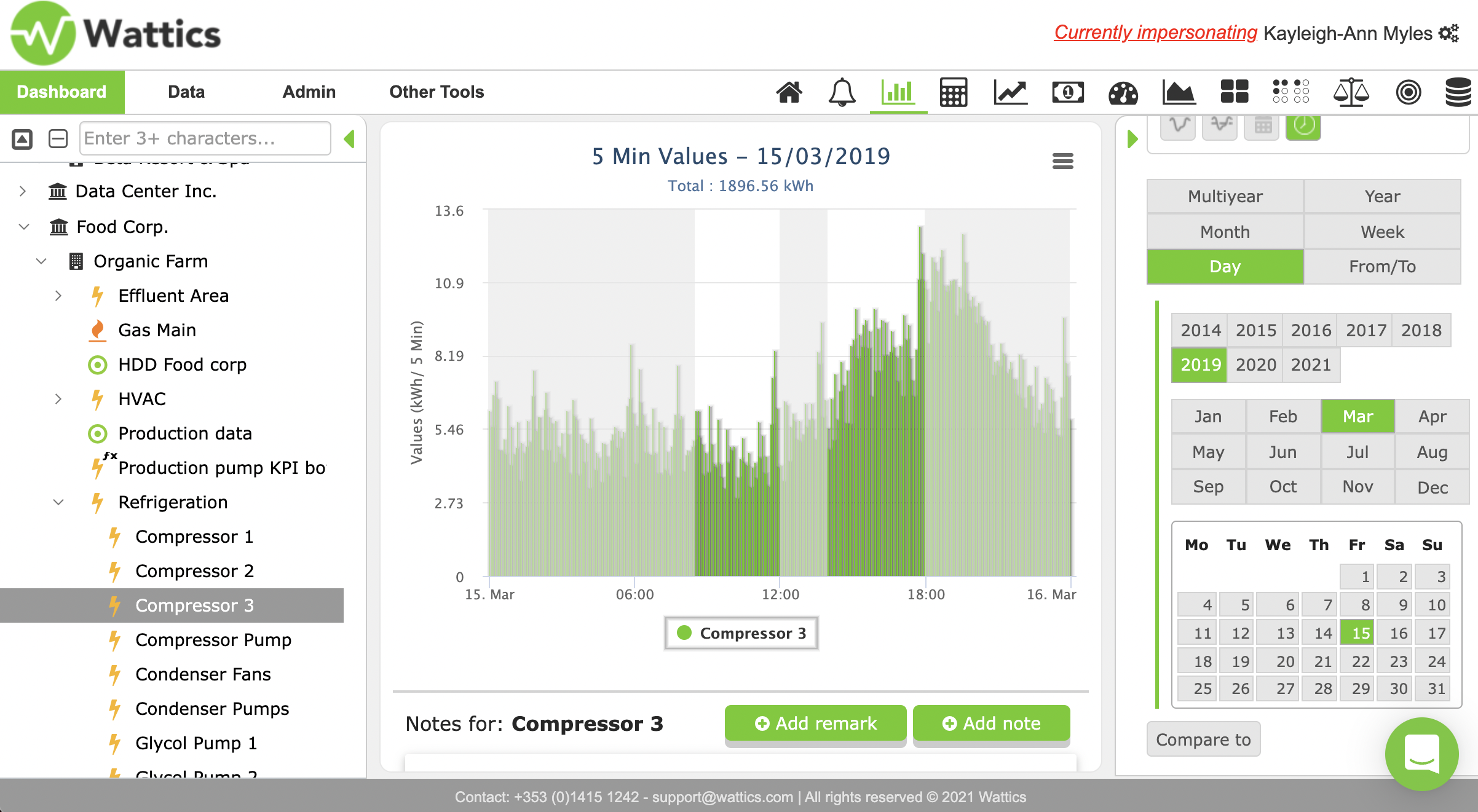
Reverting back to the pie chart example, let's look into overlays. Overlays are hardcoded 'filters' that allow you to analyse your data up against a target, the average consumption or remarks. With our newest feature AiElementsAir you can also analyse your indoor air quality data with hardcoded energy certificates in the overlays.
In example one, we wanted to determine the different data points and their consumption levels. Let us say we were looking for the largest consumption, compressor three. In the image below, the overlay has been selected on top of the data retrieved from compressor three. Here it is clearly visible that there is a saving opportunity, as outside of working hours the consumption seems to be abnormally high with a spike in consumption towards the end of the day. By using the working hours overlay you can clearly see if your energy consumption is acting abnormal outside of work-hours and identify saving opportunities.
Now that you are familiar with the breakdown feature, it is just up to you to decide which of the many tools you wish to use to analyse your energy data, CO2 emissions and costs. Best of luck!